
If your home is painted in cool gray or stark white, it may already appear outdated. Across Indiana, exterior color trends are shifting. Homeowners are choosing warmer, natural tones that feel more inviting, perform better in our unique Midwest light, and offer a more timeless appearance.
Here’s what’s replacing the old trends this season:
Warm Whites – Clean Without the Harshness
Softer, warmer whites and creams are replacing bright, stark whites. They still feel clean—but without the cold, flat look that can make a home feel uninviting, especially during Indiana’s long winter months.
Greige & Warm Neutrals – The New Go-To
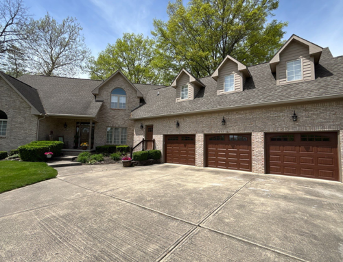
Cool grays are quickly giving way to greige, taupe, and soft beige tones. These colors complement—rather than clash with—common Indiana materials like brick and stone, creating a more natural, balanced appearance.
Earthy Tones – A Noticeable Upgrade
Colors like clay, terracotta, and warm sand are gaining popularity for one simple reason: they add depth. Instead of looking flat or generic, these tones give homes a custom, high-end feel without being overwhelming.
Natural Greens – The “Safe” Color That Isn’t Boring
Soft greens like sage and olive are becoming a new kind of neutral. They blend seamlessly with trees, lawns, and rural surroundings, making them a smart choice for many Indiana properties.
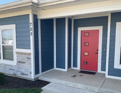
Dark Exteriors – Bold, Done Right
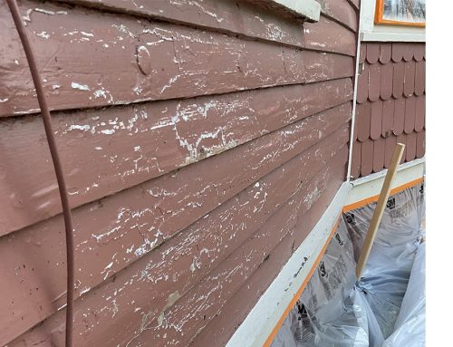
Charcoal and deep tones are growing rapidly in popularity, especially for modernizing older Indiana homes. However, dark colors present unique challenges in the Midwest. Because they absorb more heat, these surfaces can expand and contract significantly during our temperature swings—from humid 95°F July afternoons to sub-zero January nights.
To prevent premature fading or peeling, darker colors require premium, UV-resistant products and meticulous preparation. For a flawless finish that can withstand the Indiana elements, professional application is essential to avoid visible flaws and ensure long-lasting durability.
Soft Blues – Subtle, Not Trendy
Muted blues and blue-gray tones remain a strong option for homeowners who want color without going too bold. They add character while maintaining a classic, long-lasting look.
Professional Insight: The “Sunlight Test”
The biggest mistake homeowners make is choosing a color based on trends without considering how it will actually look on their home. Lighting, surroundings, and materials can completely change the final result. A color that looks perfect on a sample in a store can feel entirely different once applied to a large surface.
To avoid costly mistakes:
- Test in Real Time: Paint sample boards and move them around your home’s exterior at different times of day to see how the color shifts from morning sun to evening shade.
- Use Digital Tools: Upload a photo of your home to a visualizer app to test different palettes virtually.
- Consider the “Full Picture”: The right color isn’t just chosen—it’s evaluated against your roof color, landscaping, and neighboring homes.
The right exterior color doesn’t just update your home—it defines how it’s seen. Done right, it creates a finish that stands out today and continues to look right for years to come.